
OneNote
A visual and interaction refresh for one of Microsoft’s most-used apps, with Copilot always within reach and clear about what it is working on.
- Role
- Led product design
- Reach
- 88M+ monthly active users at peak
- Copilot
- 243% usage growth, year over year
- Timeline
- Jul 2026 — present
01 — The problem
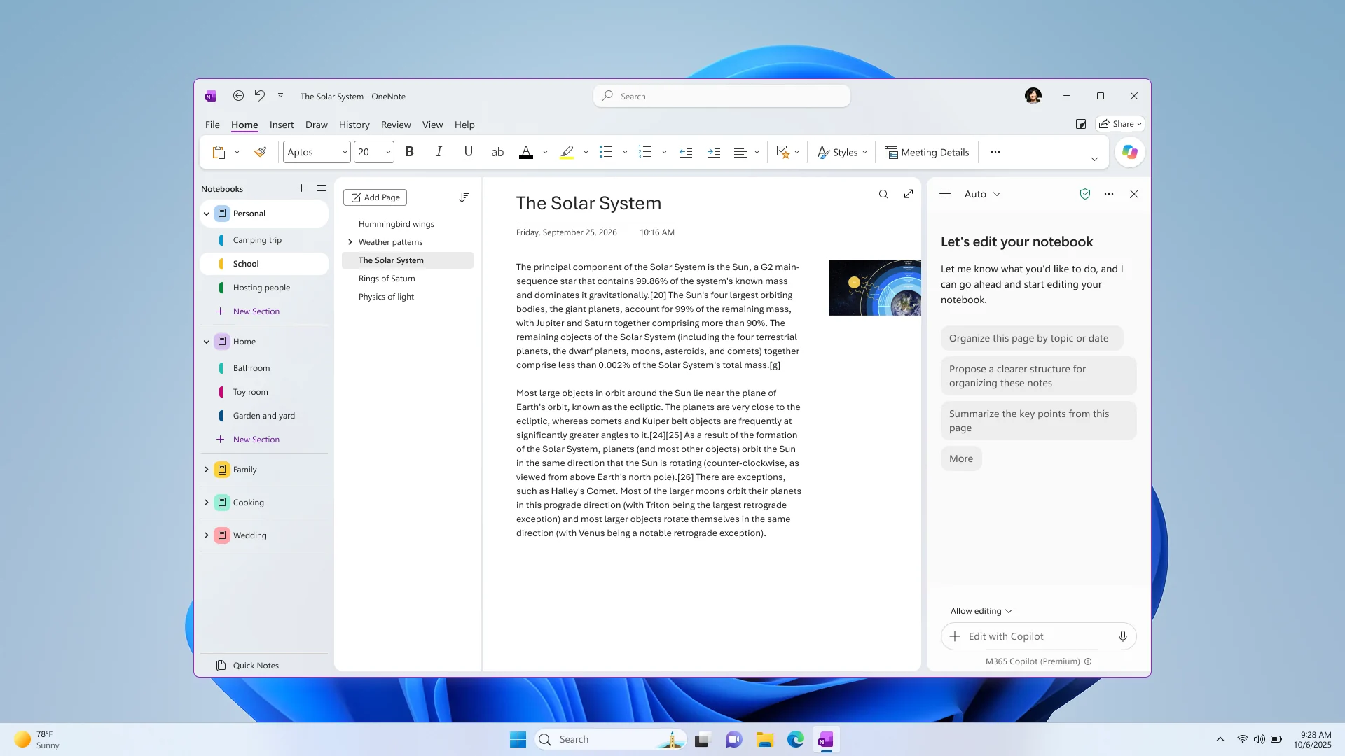
Bring Copilot into OneNote without adding more to the screen.
OneNote is where people keep years of notes. As Copilot arrived, the easy path was one more panel and one more button around the page. The work went the other way: a lighter frame, a Copilot that is always within reach, and a chat that knows what it is working on.
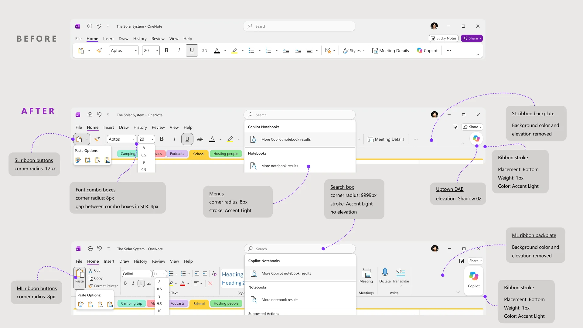
Copilot, one click away
The ribbon lost its backplate and elevation, menus and controls share one set of radii, and Copilot moved into a floating button that is always in the same place.
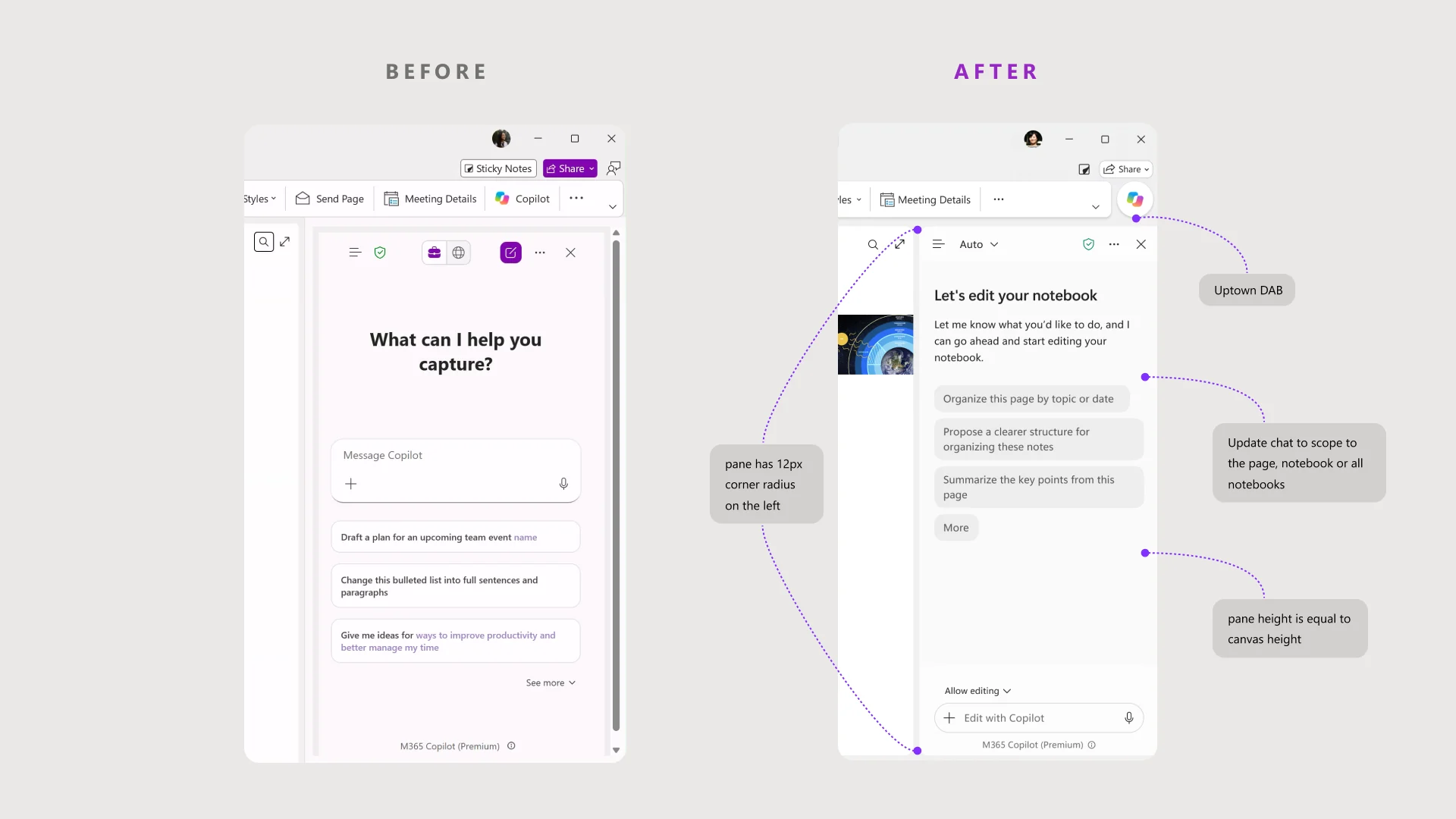
A chat that knows its scope
The pane matches the height of the page, opens with suggestions for what you are looking at, and can work on the page, the notebook or all your notebooks.
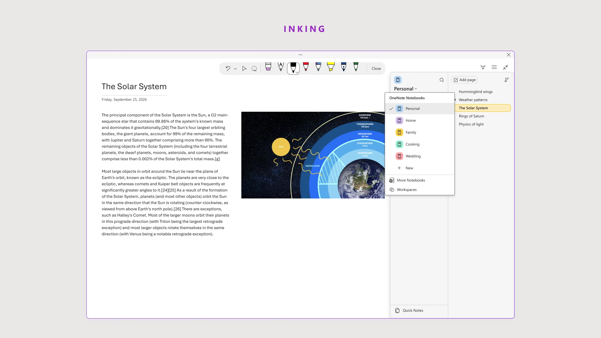
Inking, cleaned up
Pens and tools sit in one quiet row above the page, so drawing and writing don’t compete with the rest of the interface.
02 — First run
Short films instead of feature tours.
When people open the new OneNote, two short films show Copilot and the refresh in action, then get out of the way.
Meet the new Copilot
Copilot is now a floating button, always in the same place. It can act on a paragraph, the page you are on, or across your notebooks.
Visual refresh
New colors, layered surfaces, and a quieter ribbon and navigation pane come together, so the notes take the focus.
What if your notes could be remixed?
A hack-week prototype: notes pulled onto a canvas, grouped, and remixed by Copilot into new pages and new content. An early look at where OneNote could go.
04 — Outcome
[What shipped, the problems it solved for people taking notes, and what you learned.]